
Edily
Onboarding, UI Redesign
Edily is an educational learning app that takes inspiration from apps like TikTok and YouTube, bringing educational learning from Edu-fluencers to young learners.
Role & Responsibilities
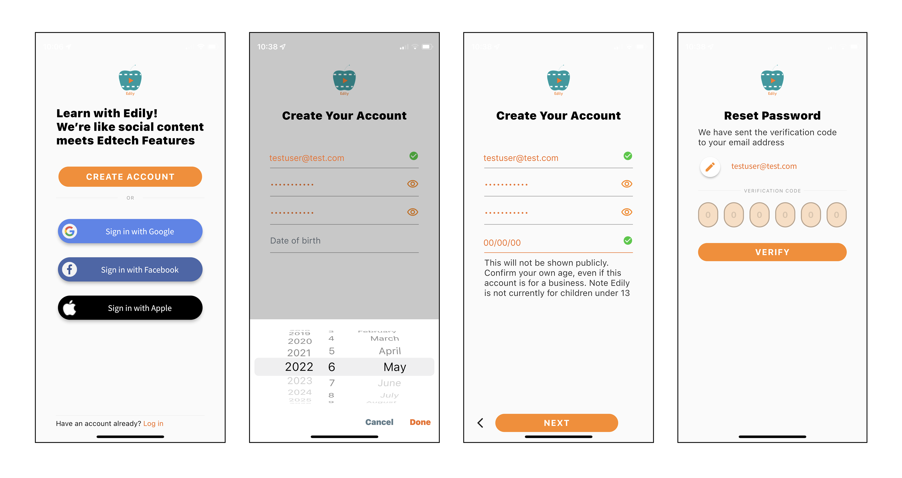
As UX Designer, I was brought on to address critical design issues within the Edily app prior to its official launch. Edily noted its onboarding as being inconsistent from other various sections of the app, and expressed concern for previous negative user feedback.
Team
Product Design, Stakeholder
Problem
Edily's app experience was disjointed. Additionally, the onboarding process had a high abandonment rate during testing and received unfavorable feedback from its targeted Gen-Z audience, raising concerns about its potential impact on user retention.
Goals & Outcomes
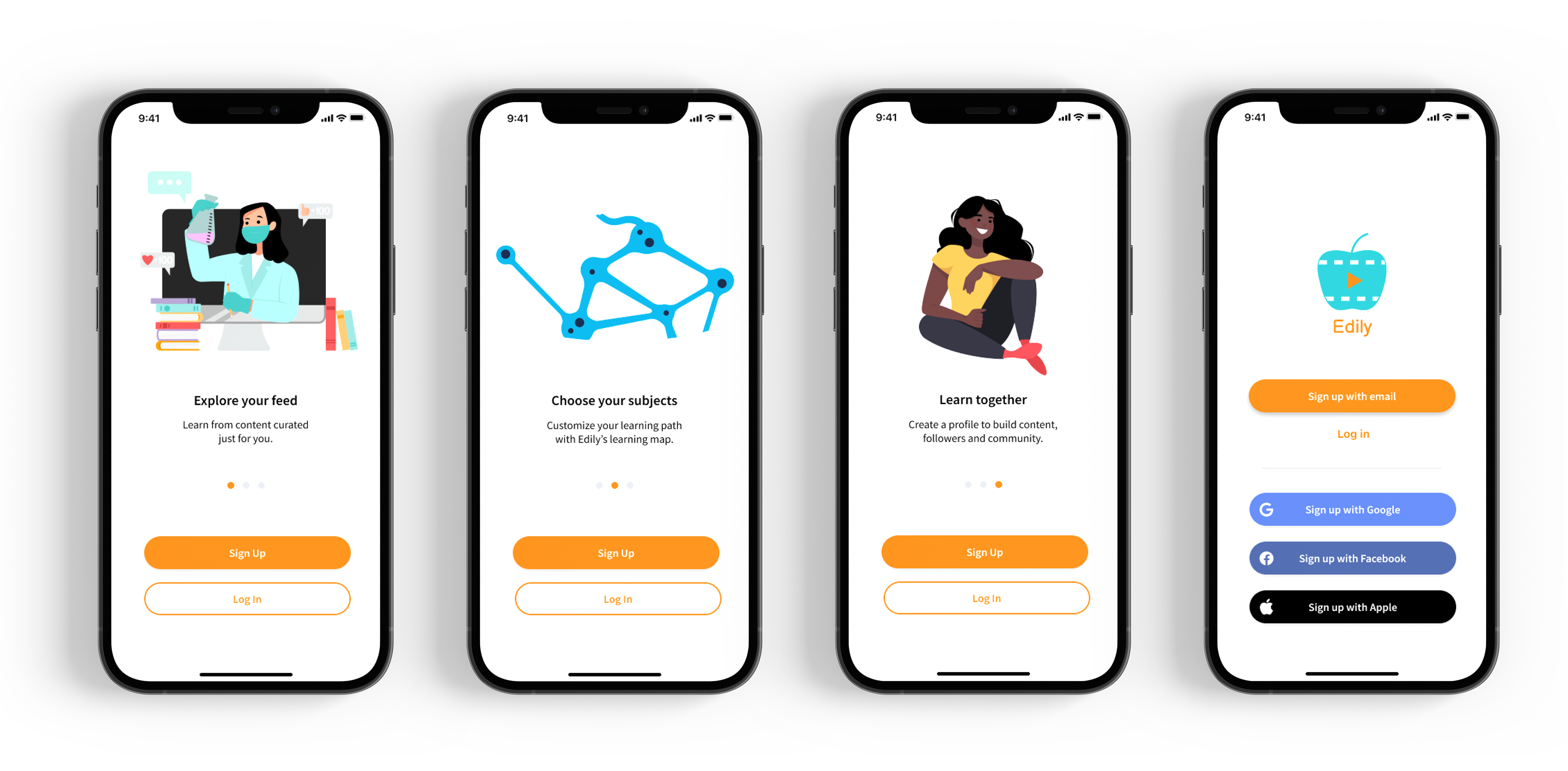
1. Achieved goal of ensuring onboarding's visual and functional unification and consistency, and exceeded goal by creating brand interest and excitement.
2. Achieved goal of user retention with 50% improvement.
Research
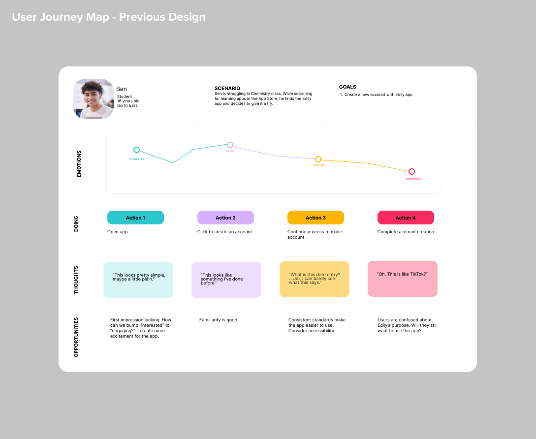
To pinpoint the root causes of user dissatisfaction during the onboarding process, I used preceding and new user feedback to develop a comprehensive user journey map that traced each step of the user experience. By mapping out the entire journey, I was able to uncover key pain points and areas of confusion that had previously gone unnoticed by the team. This insight enabled me to devise targeted design solutions that directly addressed user needs.
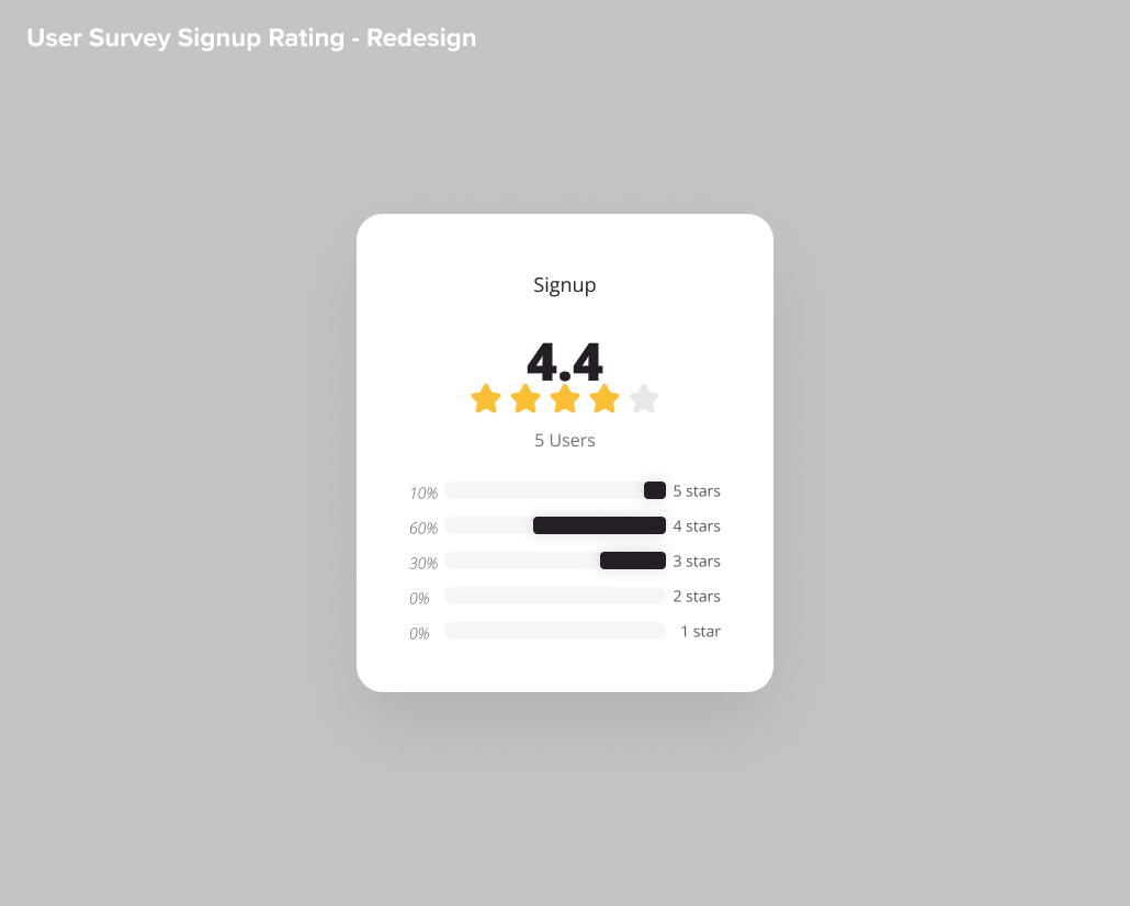
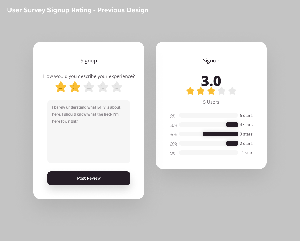
I designed and executed a comprehensive user survey aimed at collecting qualitative feedback. The survey allowed us to gauge user satisfaction levels, which initially averaged a 3 out of 5 stars rating. After implementing the redesign, we administered a follow-up survey, which revealed a significant increase in user satisfaction, resulting in an impressive 4.4 out of 5 stars rating.
To gain further insights into user experiences and expectations, I conducted a series of user tasks paired with in-depth interviews. This approach allowed me to observe user behavior firsthand and gather detailed feedback on specific pain points and areas of confusion.
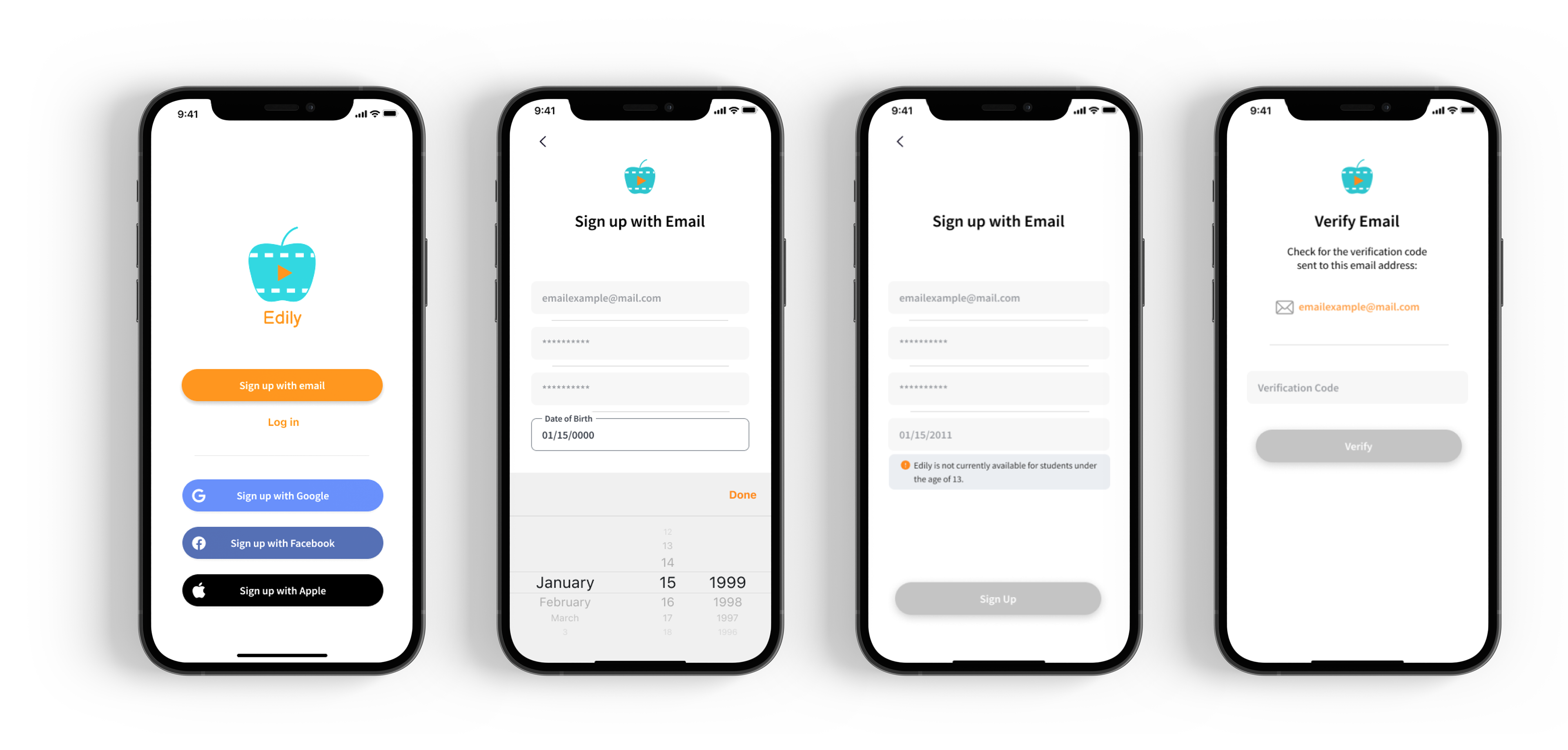
Through this process, I identified key issues that were affecting user engagement and satisfaction, including a lack of awareness of Edily's brand and purpose, perceived boredom with the app, difficulties with password verification, confusing login procedures, and prolonged load times. These findings were instrumental in guiding my design decisions.
Design & Impact
Following the initial round of design updates, we conducted further user testing to gauge the effectiveness of our solutions. We found that while the overall user experience had improved, there were still a few accessibility concerns -- notably with the size of the text input touch target. Once we enlarged the touch targets, we retested our finished product and received an approximate 46.67% improvement in user satisfaction.