blueberry
Early Branding

Monogram logo
blueberry is an online-offline contemporary art curatorial platform, founded and ran by me, that emphasizes early career and emerging artists. As the current sole employee, I create blueberry's branding material.

Expanded logo
Iterating
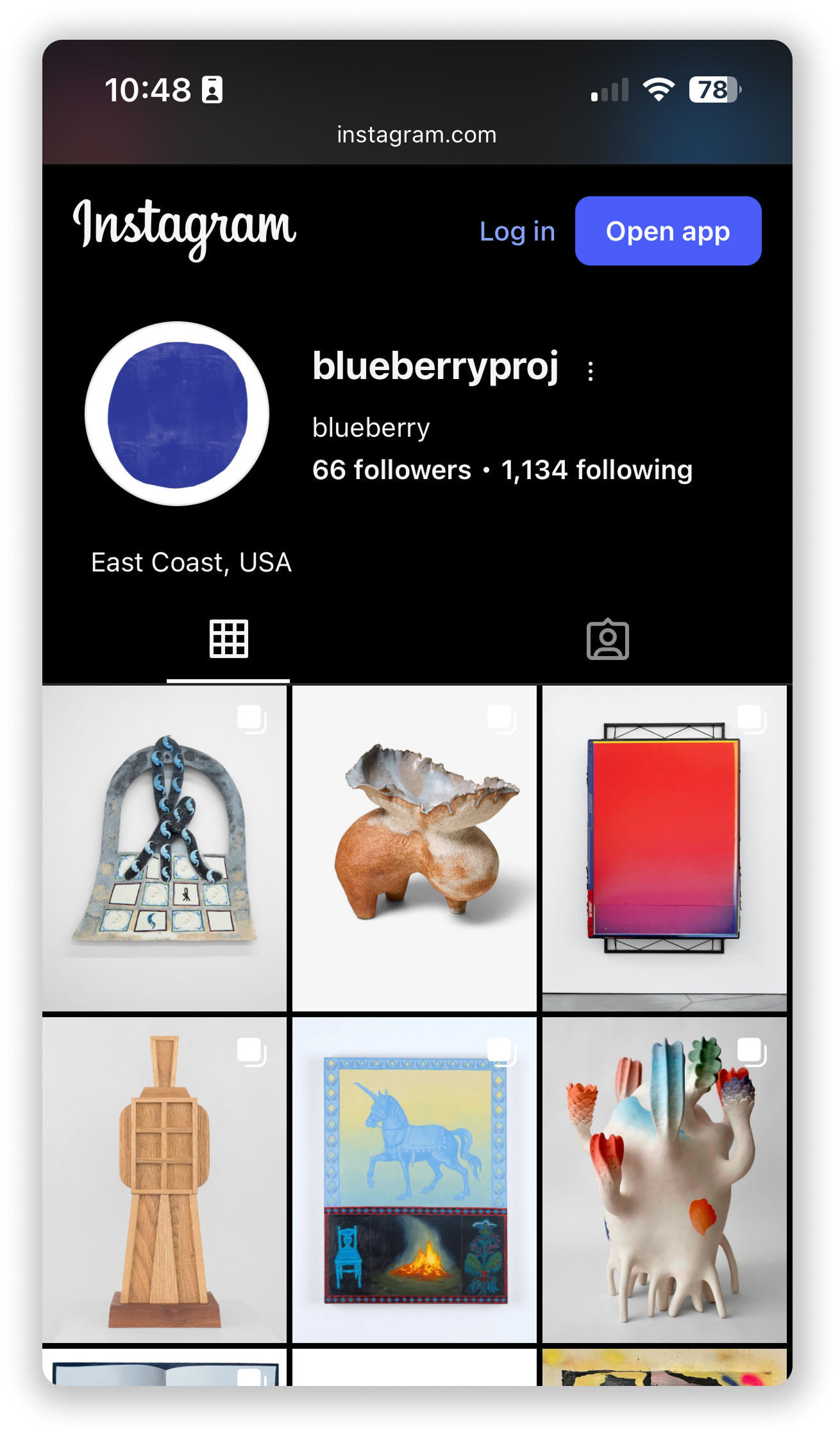
I called my platform blueberry, after the common metaphor for information. Much like a blueberry, I wanted the art I highlighted to give the audience that same feeling of finding something good and juicy. Keeping with the theme of fresh fruit, I also wanted the brand to have a sophisticated and editorial feel.

Early logo sketches
In my early sketching for the blueberry logo, I envisioned a simplified blueberry with a small detail for the calyx. I then scrapped this design, in fear that it would resemble an orange or tomato in different colors. I felt like the design wasn't achieving the sophisticated look I had originally desired, and my intention wasn't to literally replicate the fruit. I tried simplifying the design further; testing different abstracted and minimalistic shapes, and even abandoning the original idea entirely to play with text, first on paper and later digitally. After creating a design that looked a lot like an olive, it sparked a new idea; to paint the logo. I wanted to replicate the rarity and noteworthiness of something handmade with a cool painterly effect that I could try to recreate digitally.
In the end, I felt the organic shapes the painted logos had created a subtle nod to a blueberry while remaining sophisticated, and minimalistic enough for print. I decided to prioritize this kind of shape for the digital recreation. I also added a textural state, which I think bridges the gap between art and blueberries effectively.
I also established a typed logo, that can be displayed with or without the iconography. I think all of the blueberry logos have great utility, and represent the brand well.

Final logo designs
blueberry is still in its infancy, and is recruiting artists daily. To help connect myself with potential clients, I created business cards. When turned red, blueberry's logo becomes a nod to the circle-shaped stickers found on purchased artwork in a gallery show, so I thought it would be fun to model my business cards after a gallery's artwork placards. Each card has a an artwork title that is editable by its owner, effectively making each card part of a small run of printed art, as well as an effective way to promote the project.

